B2B, Product Design
Improving the taxonomy editing experience of Stratifyd's data analytics platform
Impact
The newly designed taxonomy preview feature was launched in 2021 and received tons of positive feedbacks from users and internal solution engineers since. It saved them hours of editing time and made their job easier.
Collaborated with
Product Manager, Front-end Engineers, Solution Engineers
ROLE
Sole Product Designer - research, design, prototyping, testing, css implementation
Year
2021
Project Design Process Overview
😩
Understand the users and the issues they experienced
🎨 + 👨🏻💻
Align design requirements with PM
🧐
Audit the existing flow
🎨
Design the user flow
🏗️
Design explorations & alignment
😩
Navigate though challenges & feedbacks
🎨
Design iterations
🚀
Final design
Understand the Problems
Majority of our users are customer experience (CX) professionals. They use our platform to uncover insights from unstructured textual data. Taxonomy is a tool that they use to help categorize their textual data into topics that they care about.
In order to understand how users modify their taxonomy rules, I interviewed our solution engineers who frequently helps our customers build taxonomies. I learned that users often add a bunch of keywords to the taxonomy rules for a specific topic that they would like to learn from the data
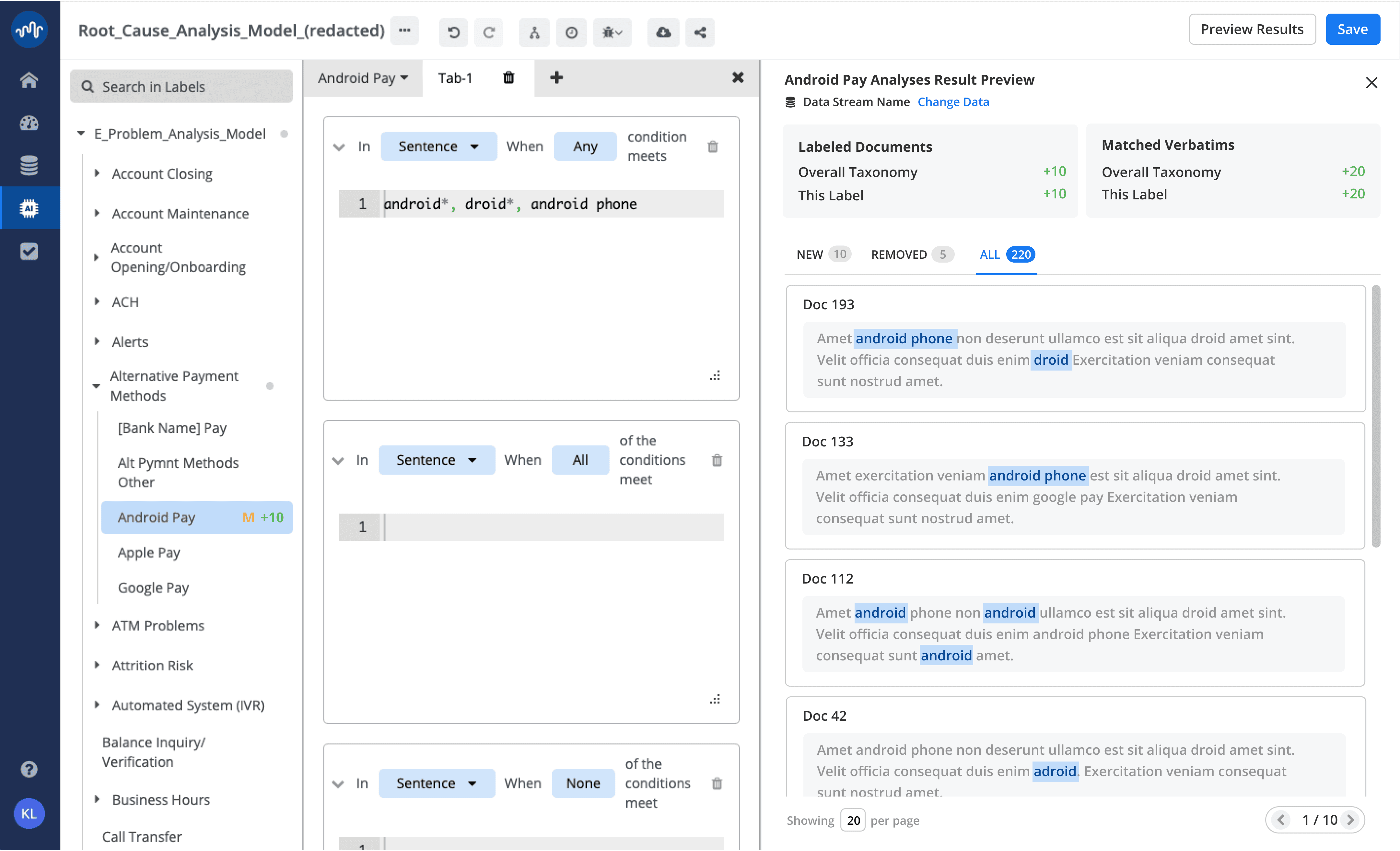
Example of the taxonomy rules used by the user
For a topic like "account closing", a user wants to match all the customer review data that contains the word "account". But sometimes the word "account" was not spelled correctly in the data, so the user would add all the possible misspells to the topic rules, in order to improve the matching results.
Our users often modify the rules in each taxonomy topic to improve their data matching results, but they could not do it efficiently due to two main reasons:
Problem #1
Time consuming and changes were permanent
When users edit taxonomy rules, they would have to save the changes, reprocess, and then wait for the taxonomy to run, which can take very long if the data was huge.
Problem #2
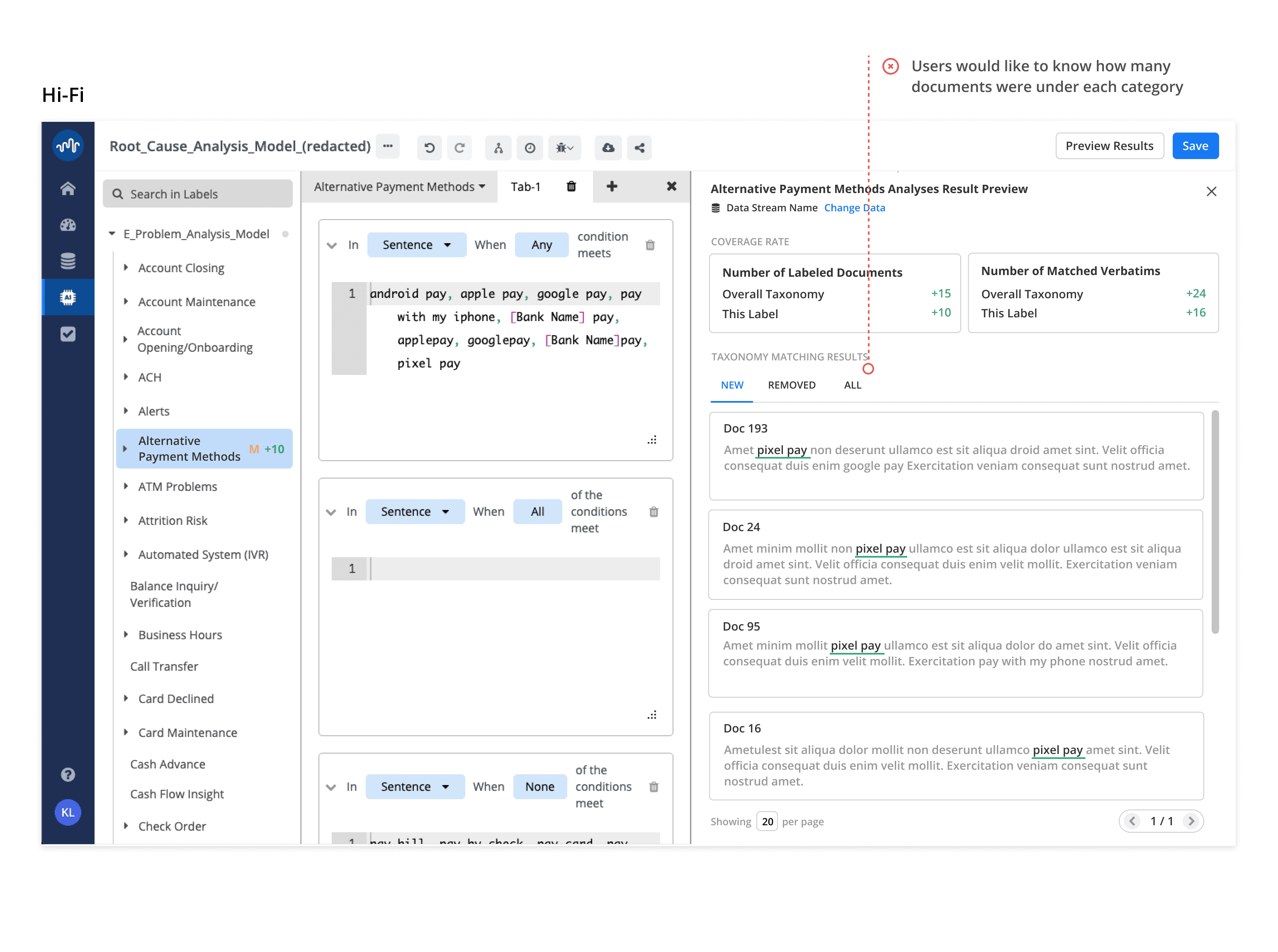
It was hard to tell what has been improved
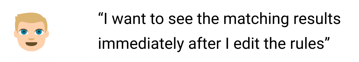
Users would have to go into a dashboard to look at the results in verbatim and essentially guess what changed as the result of what they have done in the taxonomy.
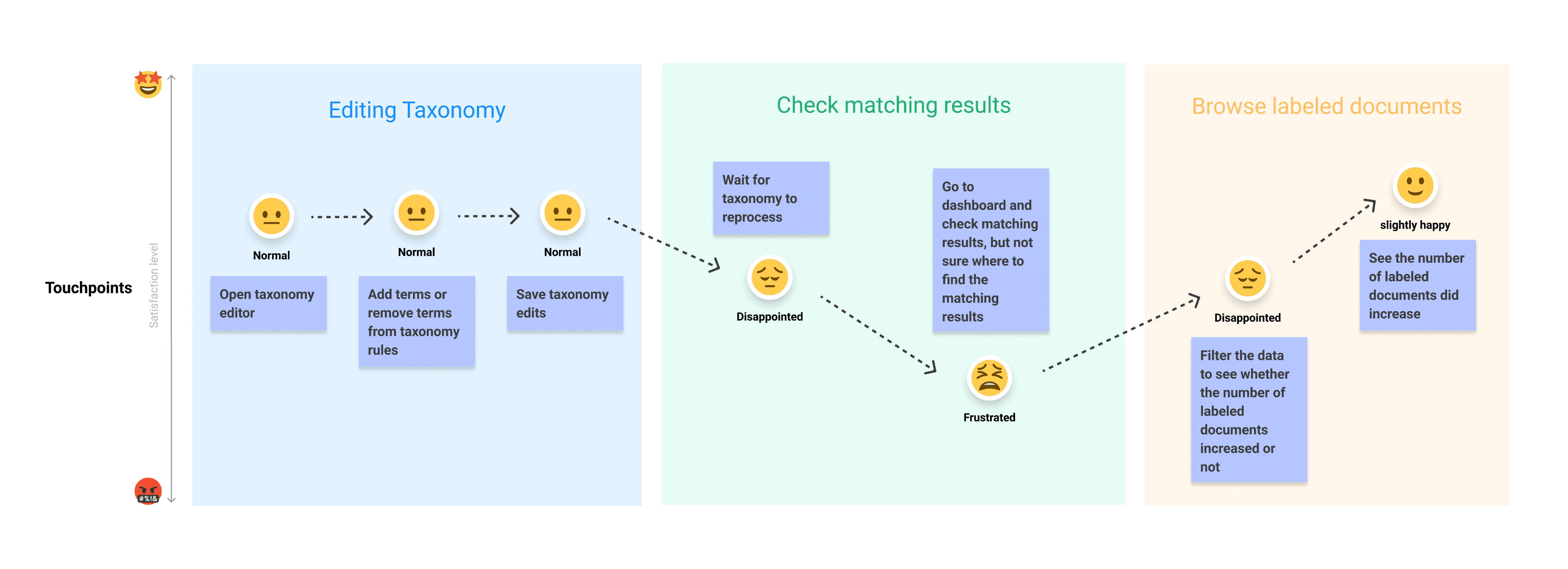
User Journey & Feedbacks

So my Product Manager and I landed on 3 key requirements for this project:
✅
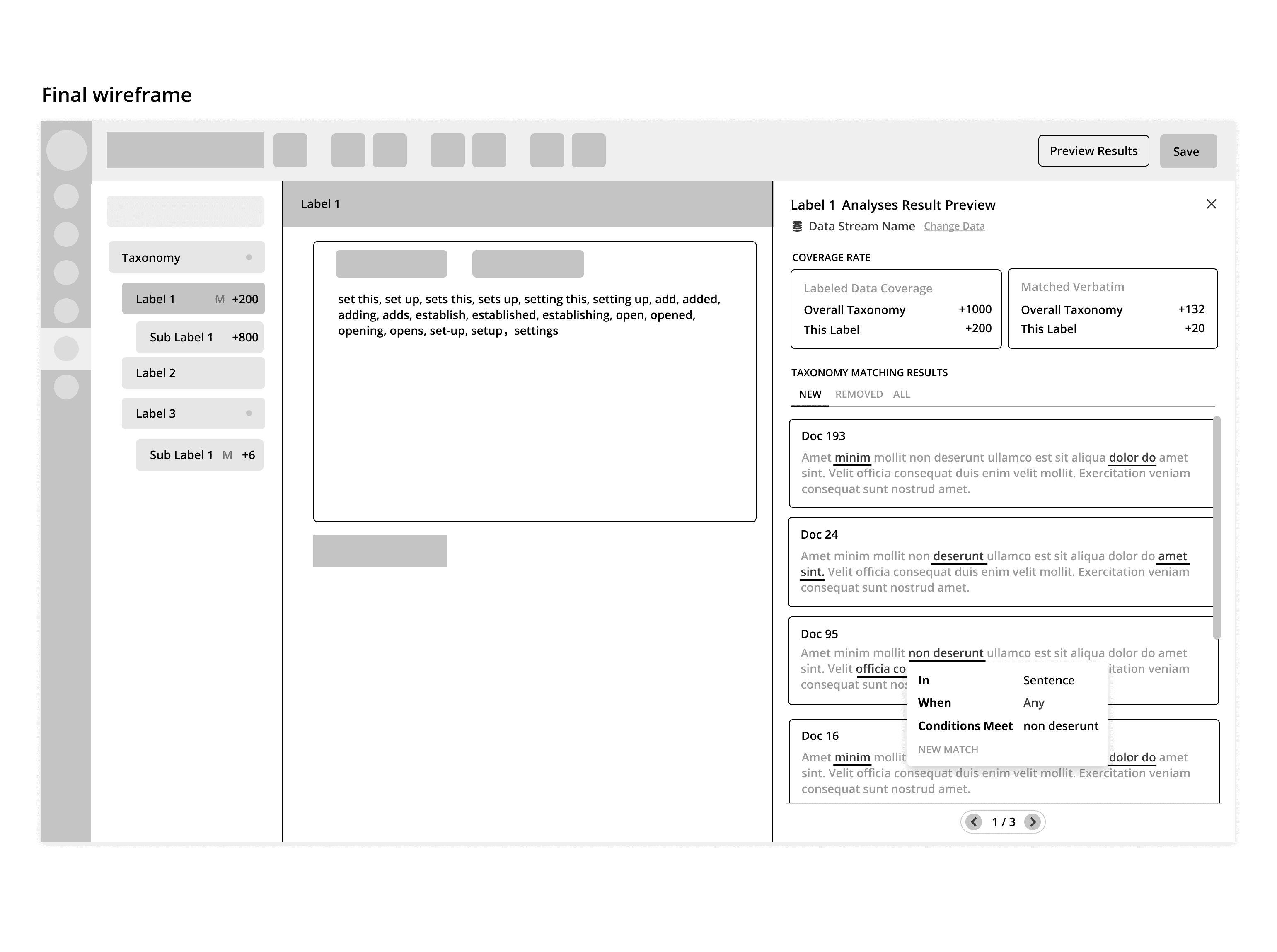
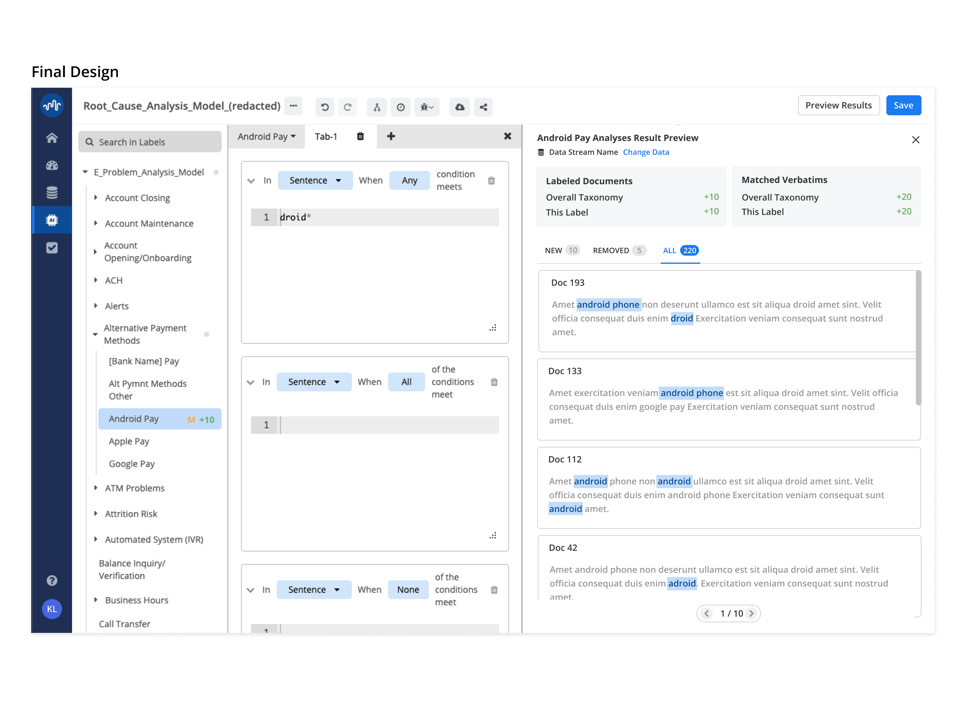
Allowing users to see matching results immediately before saving
✅
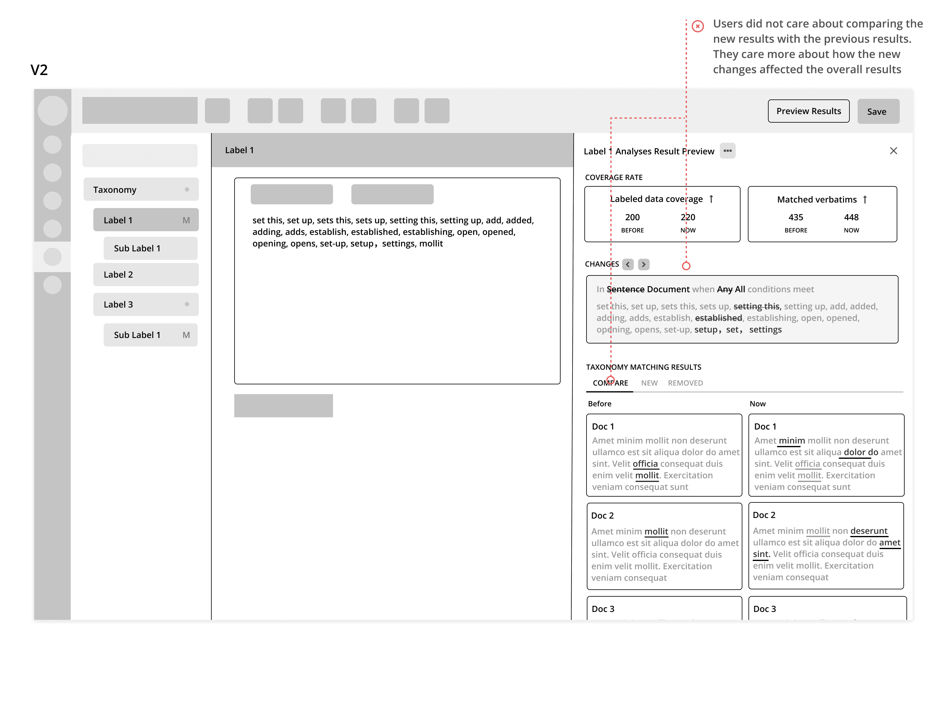
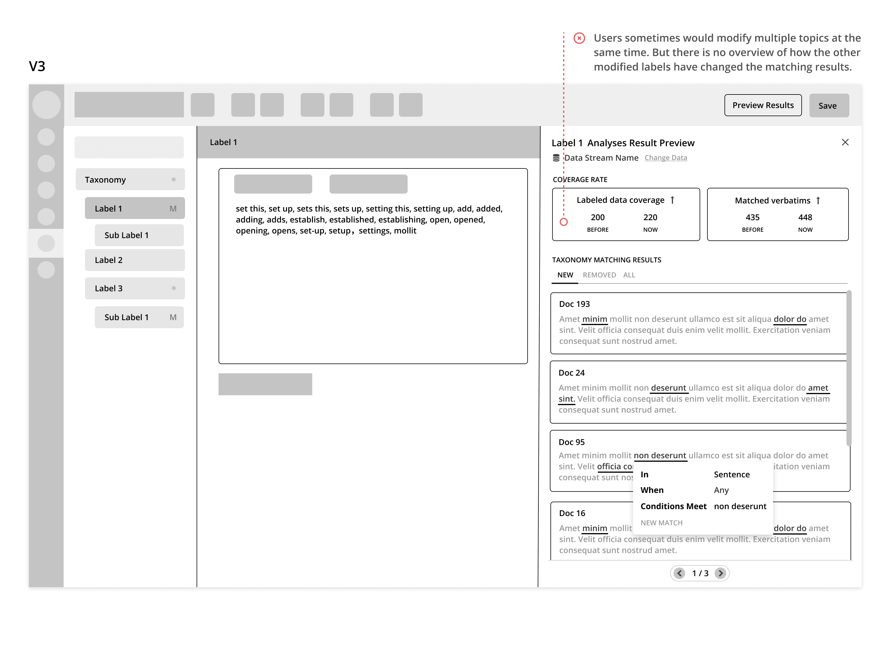
Providing an overview of how the matching results were improved by the changes
✅
Providing data samples that reflect the changes in the taxonomy
Uncover an Existing Solution
As we were having a discussion about how to solve the problem as a team, one developer who originally designed and built the taxonomy editing feature, pointed out that there was already a solution in-place for the problem we trying to solve.
So with a little help from the developer, I found the feature and played around with it.
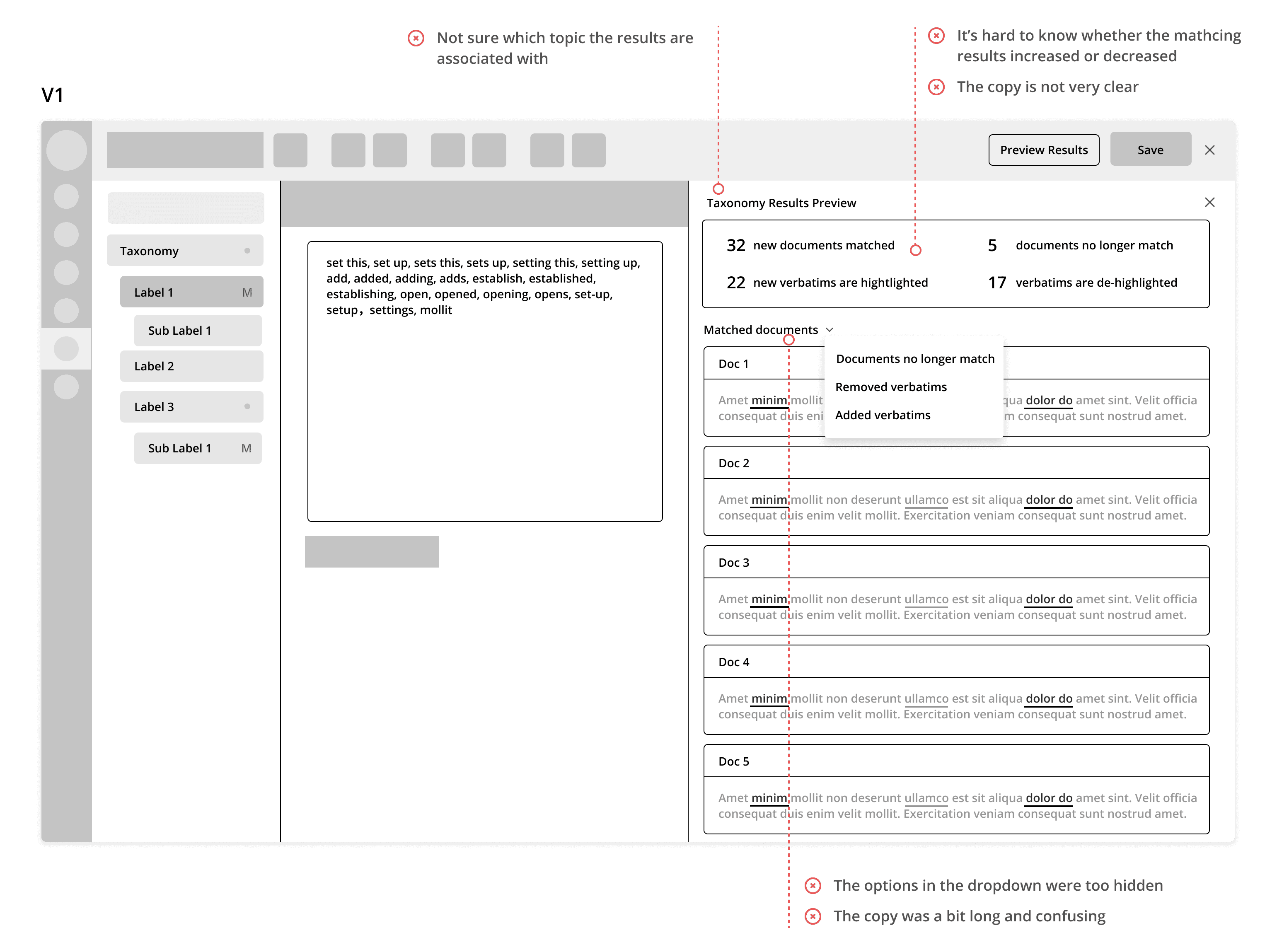
The solution does solve the majority of the problem, however, it was not utilized by our customers, because of the following issues:

1. The entry point was too hidden and unintuitive:
The entry point of this feature was a small button with a bug icon on the main menu bar. The feature was called "debug", which is not a term that our clients are familiar with.
2. Users still couldn't see whether the overall matching records increased or decreased
The tool only shows the total number of records matched by the taxonomy, but it did not tell users whether their edits improved the overall matching results or not, and yet this is the most important functionality that users are looking for.
3. Users could see the data sample for the changes but the interaction was still clunky
Since the matching results were displayed in a modal dialog, users cannot edit the taxonomy while looking at the matching results. So they would have to reopen the dialog every time they need to check the results.
So in order to ensure fast development cycle, the design goal became:
✅
Allowing users to see matching results immediately before saving
✅
Providing an overview of how the matching results were improved by the changes
✅
Providing data samples that reflect the changes in the taxonomy
utilizing the existing functionality
Mapping Out the New User Flow
So based on the users' current taxonomy editing journey and the existing solution, I came up with the initial user task flow:
Design Explorations and Iterations
After discussing the user task flow with the team, I started to create some low fidelity wireframes to help illustrate my ideas.
Challenge - Finding the Right Feedbacks
When this project started, the product team was a relative new team and did not really have a good design review process in place. We also didn't have users that we can reach out to test the design. This created some challenges on getting the right feedbacks for my designs.
Since the feature was originally designed by our lead front-end engineer, who was very familiar with the taxonomy experience and the original requirements for the feature, I worked with him to get feedbacks for a few iterations early on.
However, I soon realized that some of his feedbacks were not very aligned with users' goals and behaviors that I defined at the beginning. So I took the design to the solution engineers who were familiar with building taxonomies for customers.
With their help, I was able to get back on track and improve my design in each iteration.
Final Interactive Prototype
Reflection & Learnings
What can be improved
In retrospect, if I were to do it again, I would want to go beyond feature level and come up with solutions that not just improve the Taxonomy Builder tool, but thinking about how to make theme discovery even easier for the users
What I learned
1. Always referring back to user goals and task flows if got lost.
In this project, user goals and task flows that were defined at the beginning of the project helped a lot for me to gain users' perspective and prioritize the feedbacks, especially when there was a lot of perspectives given within the team.
2. When the testing resources are limited, getting as much feedbacks as possible is very helpful.
Since we are a small company, we don't really have a user testing process in place with external users. In order to validate my design, I showed my design to different internal team members and internal power users. As a result, I was able to get valuable feedbacks and improve my design.
3. It's valuable to observe how users are actually using the product.
Asking users about how they use a specific feature can sometimes result in missing other use cases. The initial interview was too focused on one use case of the taxonomy editing, which is opening the taxonomy editor and start editing. By observing how users use taxonomy in a different context, I could generate better ideas for helping users to achieve their goals.