End-to-End Design, Cross-functional leadership
Transforming the header of Nuts.com and improving overall site conversation
Collaborated with
Product Manager, Front-end Developers, E-commerce Manager, Creative Director
ROLE
Sole Product Designer
Year
2023 & 2024
Timeline
5 months - Phase 1
Impact Summary
+0.89%
Conversion rate uplift - phase 1
+2.30%
Conversion rate uplift - phase 2
+1%
AOV uplift
Improved Clarity
For site navigation experience
Boost Confidence
In cross-functional collaboration
Built the Foundation
For future business growth
The Business Problem
Business goal: grow the business & expand the customer base
Nuts.com is a direct-to-consumer company that sells premium, high-quality snacks. As part of the growth strategy, the business wanted to expand to younger demographics who care deeply about brand experience
The solution: site modernization
The challenge was that an outdated site signals low quality, regardless of how good the products actually are. The company needed to elevate their brand through a modern site experience
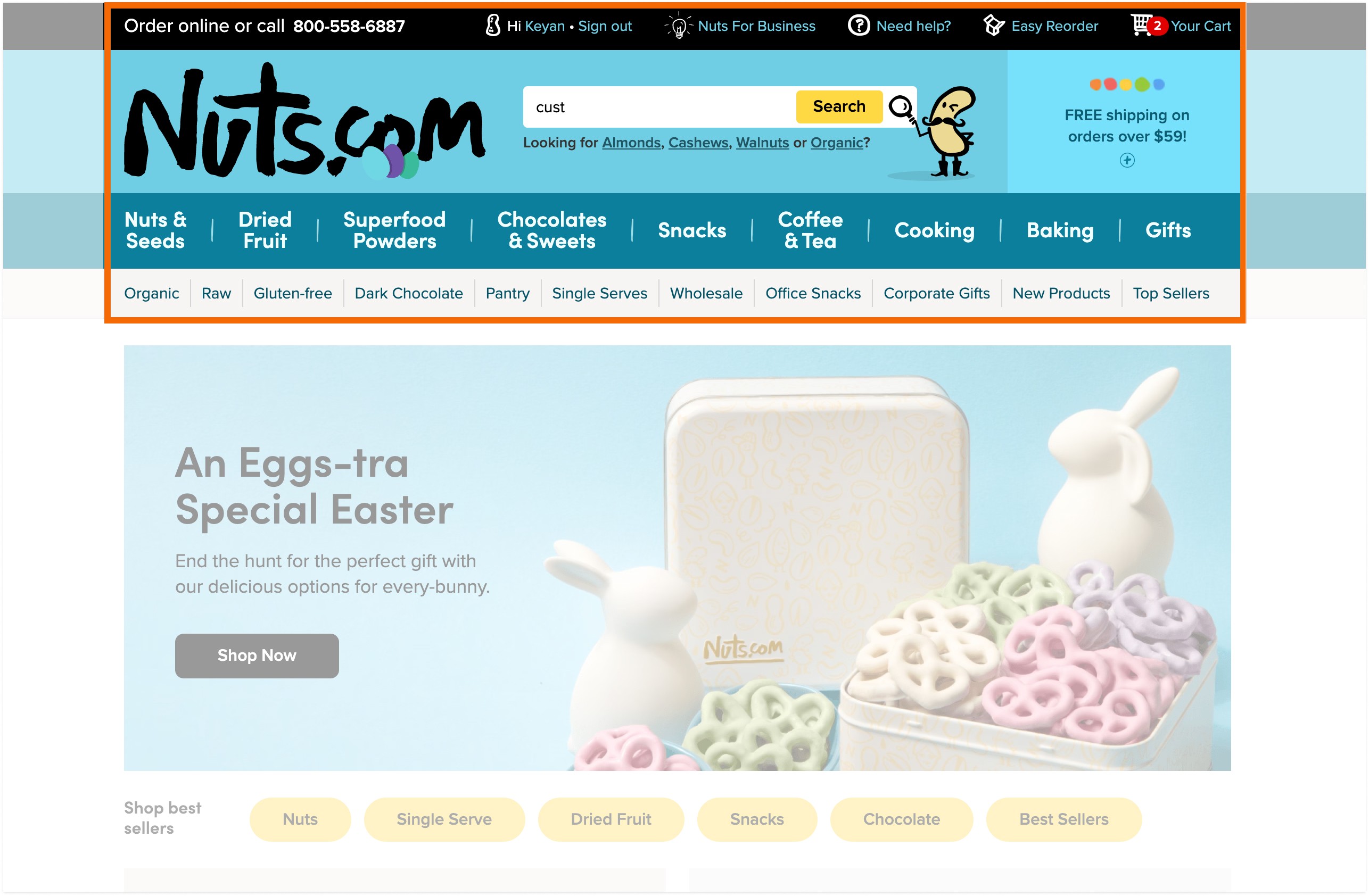
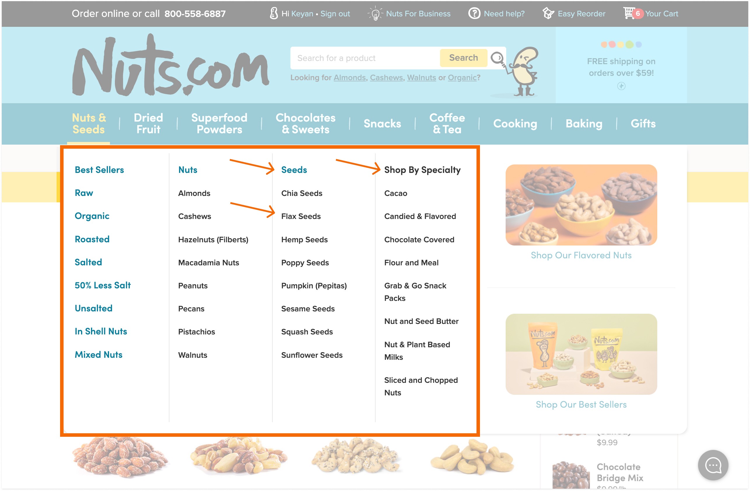
The site header was mission critical:
🌟
It defines the look & feel of the entire site
🌟
98% of the new customers use it to explore categories & find what they need
🌟
Important to returning customers to explore categories & reorder
My Challenge: From Simple "UI Refresh" to Strategic Design
Leadership asked for a "modern refresh" with a tight timeline. But I saw a risk and proposed a discovery research plan
I've noticed deeper issues—confusing categorization, unclear hierarchy—and I was concerned that changing the navigation without understanding how customers used it could actually hurt conversions, so I proposed start with discovery research, learning what exactly went wrong with the header.
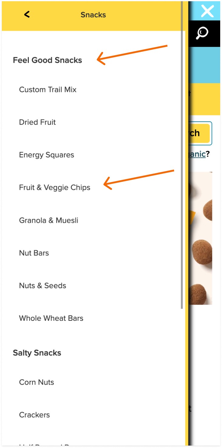
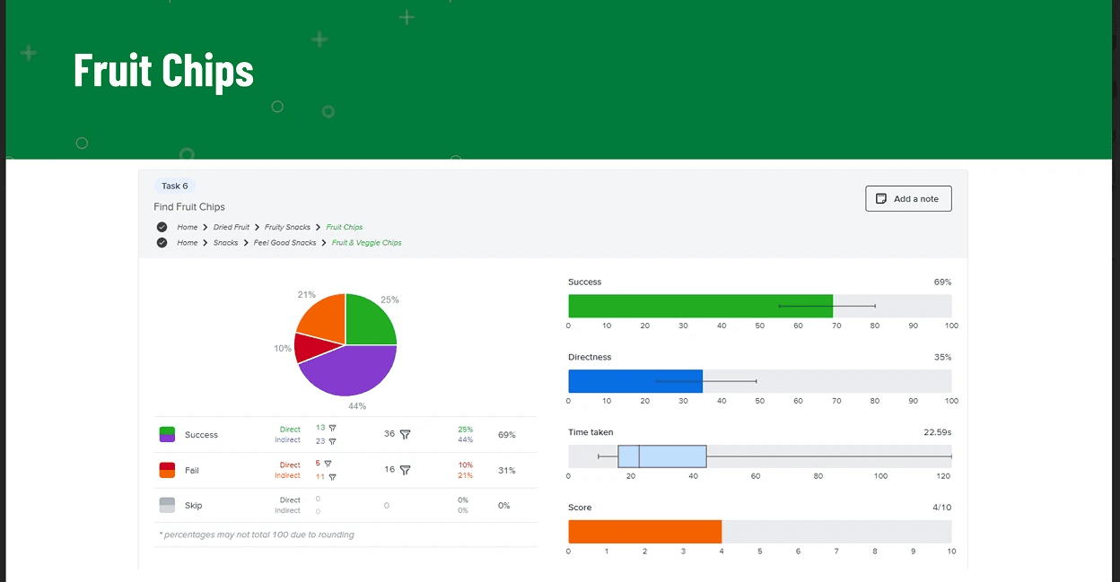
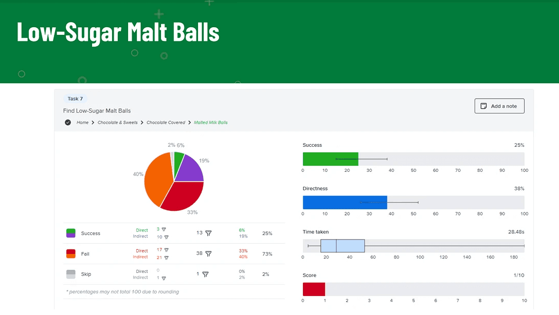
Striking discovery: 43% of the participants gave up because they couldn't find products during user testing
During the discovery research, turns out the usability issues were more striking than I thought. Here are the main issues that I found using the research:
Identified missing business opportunities that can unlock more growth
Not only the usability issue was more severe than we thought, my PM and I also found a bunch of missed business opportunities that hinders growth - Search missing autocomplete & history, Cart & Reorder links were buried, and inflexibility for the business's growth needs
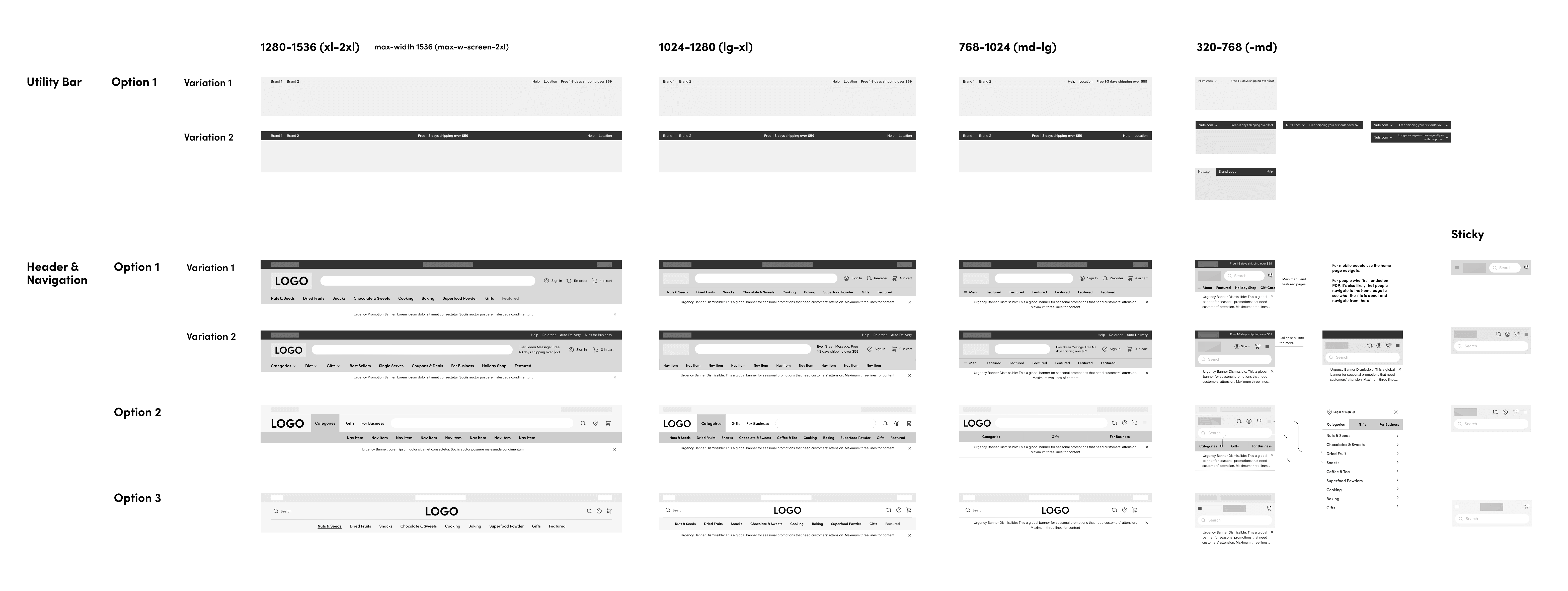
Key Design Changes with Phased Rollout Plan
Since the header redesign consisted of a lot of changes and required decent amount of cross-functional work, my PM and I broke the project down into different phases so that we were able to:
Measure the impact of each major change effectively and iterate quickly when A/B testing showed a negative trend on the metrics
Ship impactful results while working with the limitations each cross-functional team had
Phase #1.1
Clean up the visual hierarchy + improving navigation scannability (Shipped)
In this round of the A/B testing, we saw a 0.89% overall conversion uplift.
Before

After
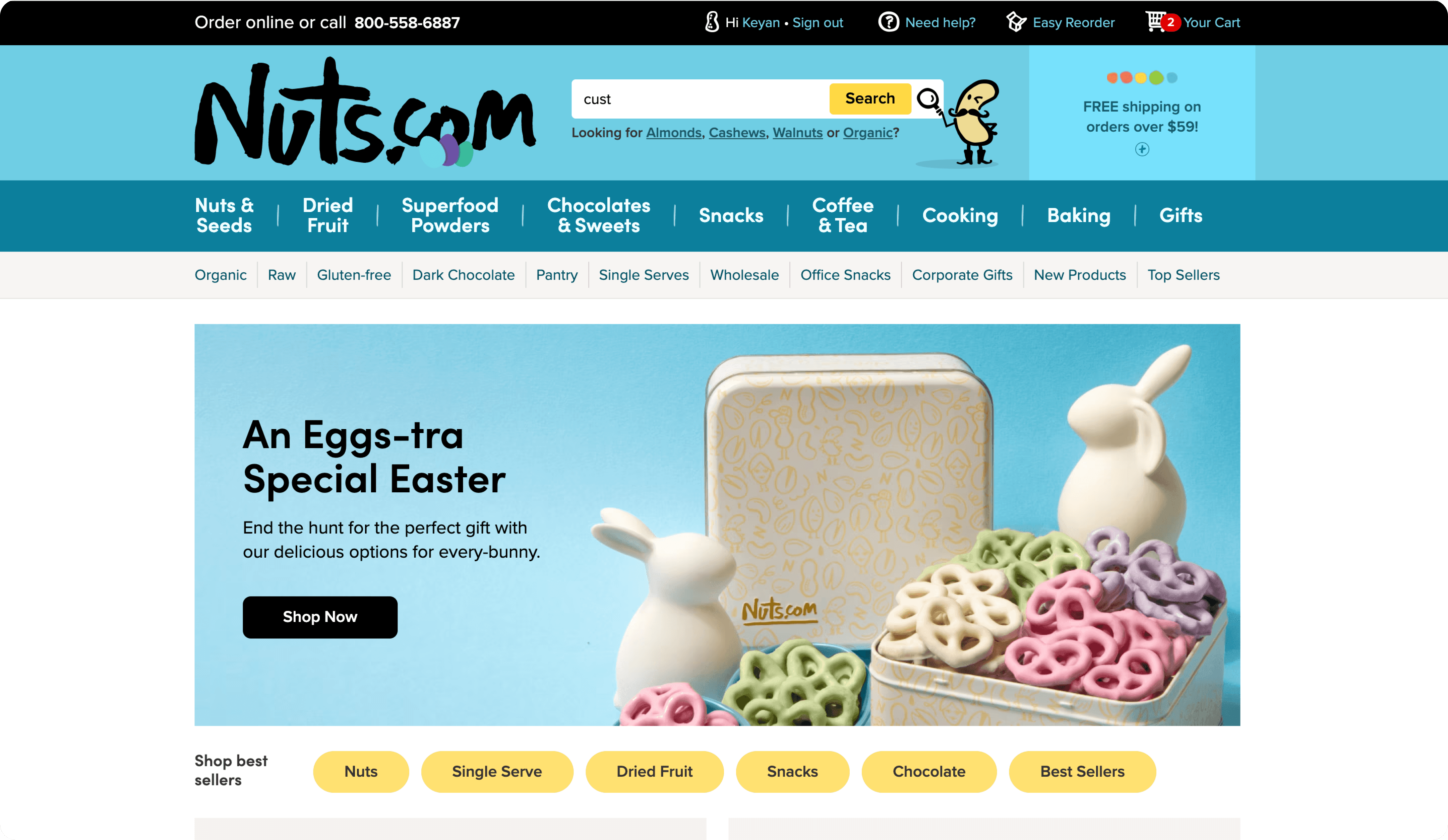
Phase #1.2
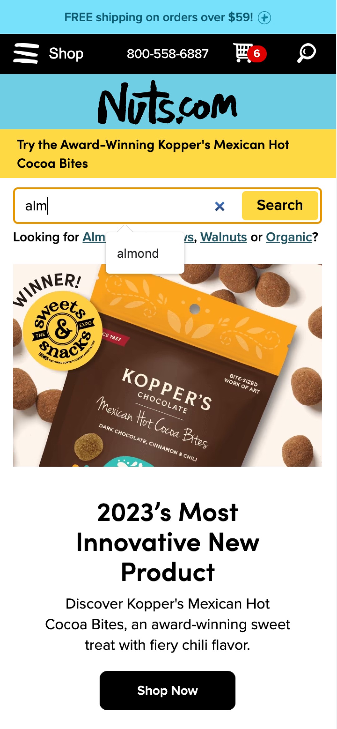
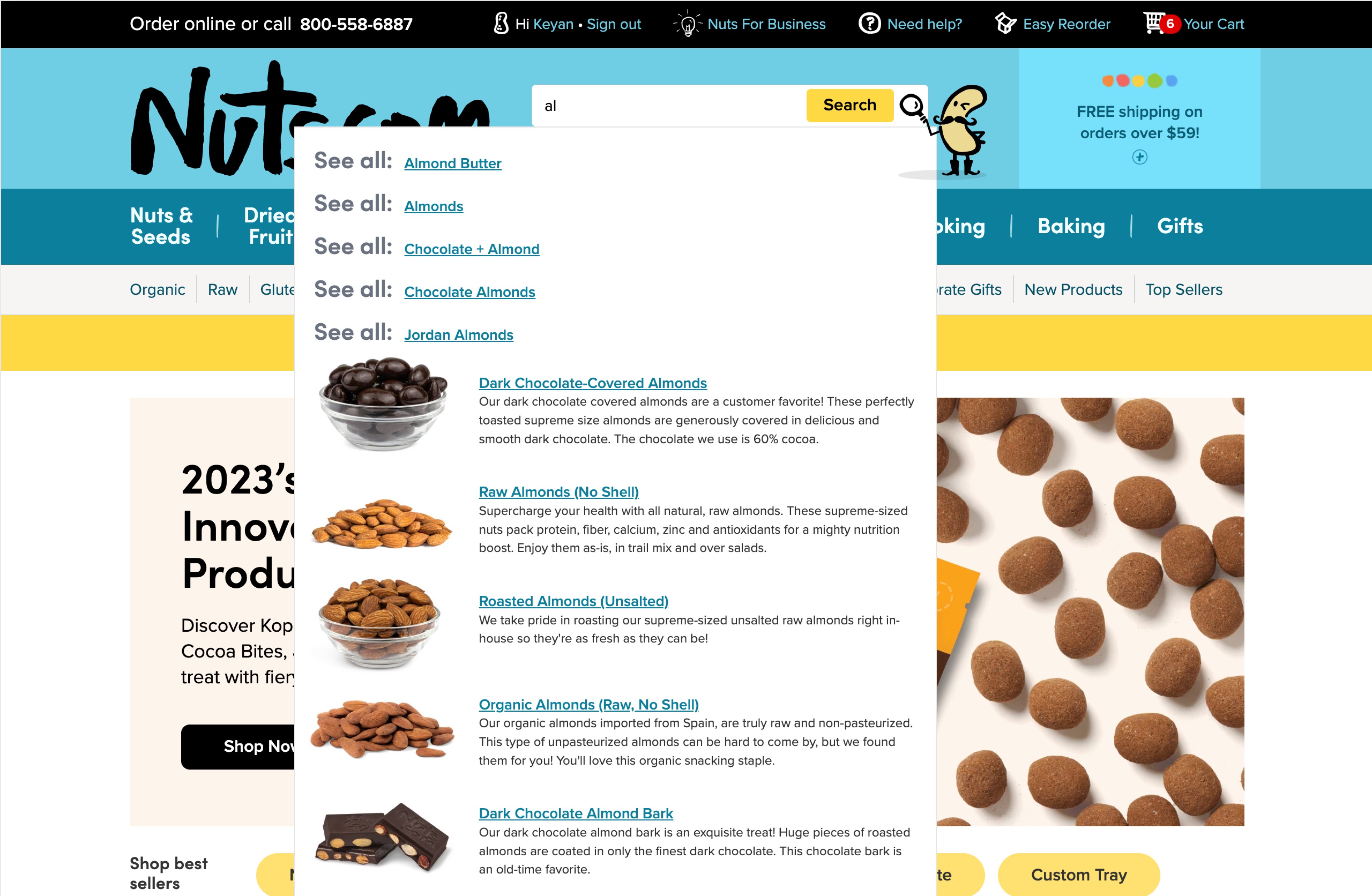
Search functionalities optimization - auto-complete, search history, and category recommendations (Shipped on Mobile)
For mobile experience specifically, the conversion rate was up by 1.73%
Before
After
Phase #2
Optimized the high converting utility links + consolidated categories (Live )
The goal for this phase was to isolate the changes that affecting return customers experience, so we can measure the impact clearly. During phase 2 testing, we saw a 1.00% uplift in AOV, increasing traffic to the reorder page, and meaningful improvement on bounce rate.

So…How I Got Here
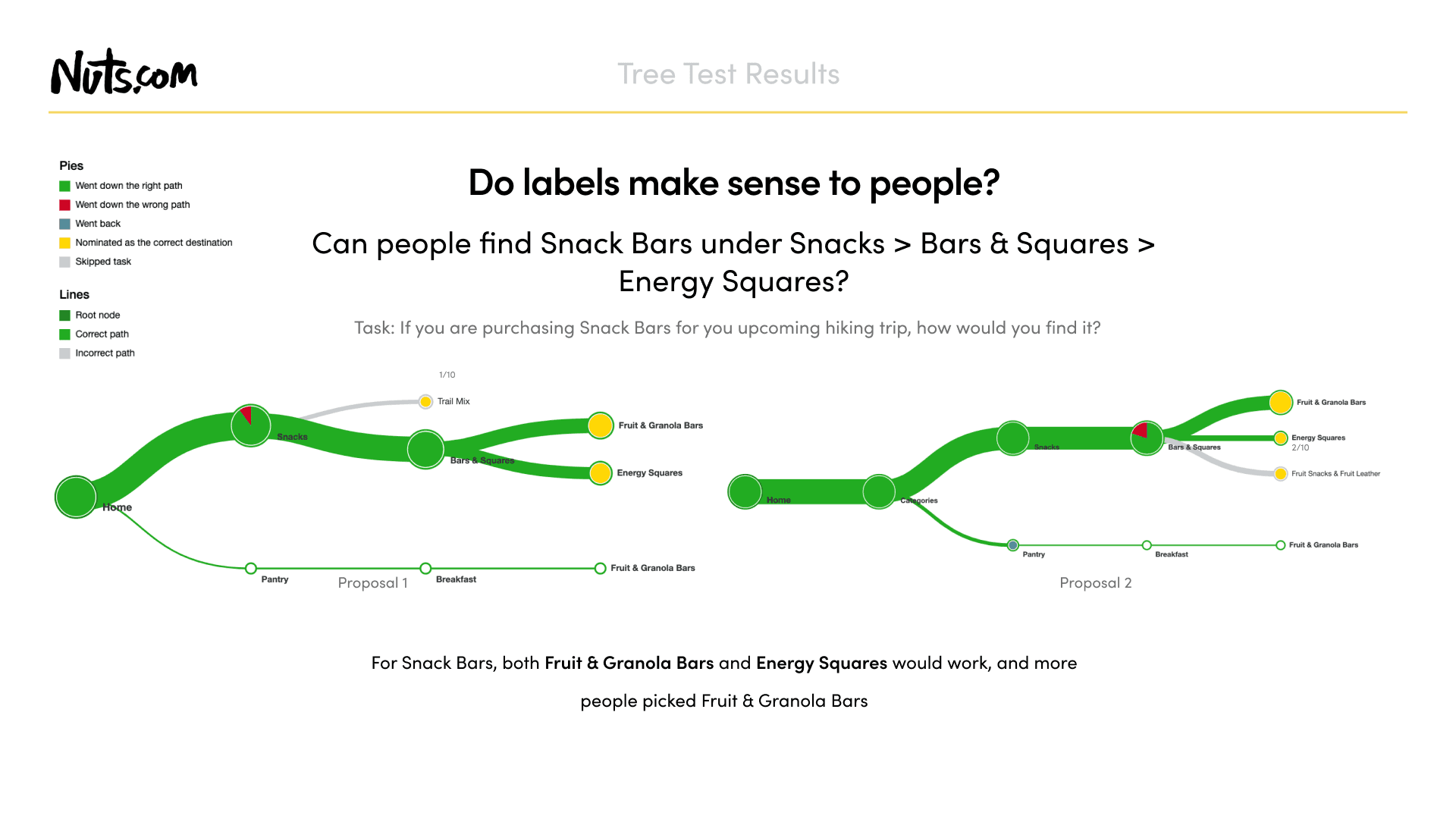
Based on the business goals, usability issues that I learned, and the patterns that I saw on other sites that have large product catalog, I broke the header into 2 parts and started my design exploration:
Utilities - Search, Reorder, Cart etc (Collaborated with Engineering team)
Navigation IA - Category Structures (Collaborated with Merchandising team)
Finally, I narrowed down to three directions and discussed the pros and cons with my team and stakeholders.
Design Explorations
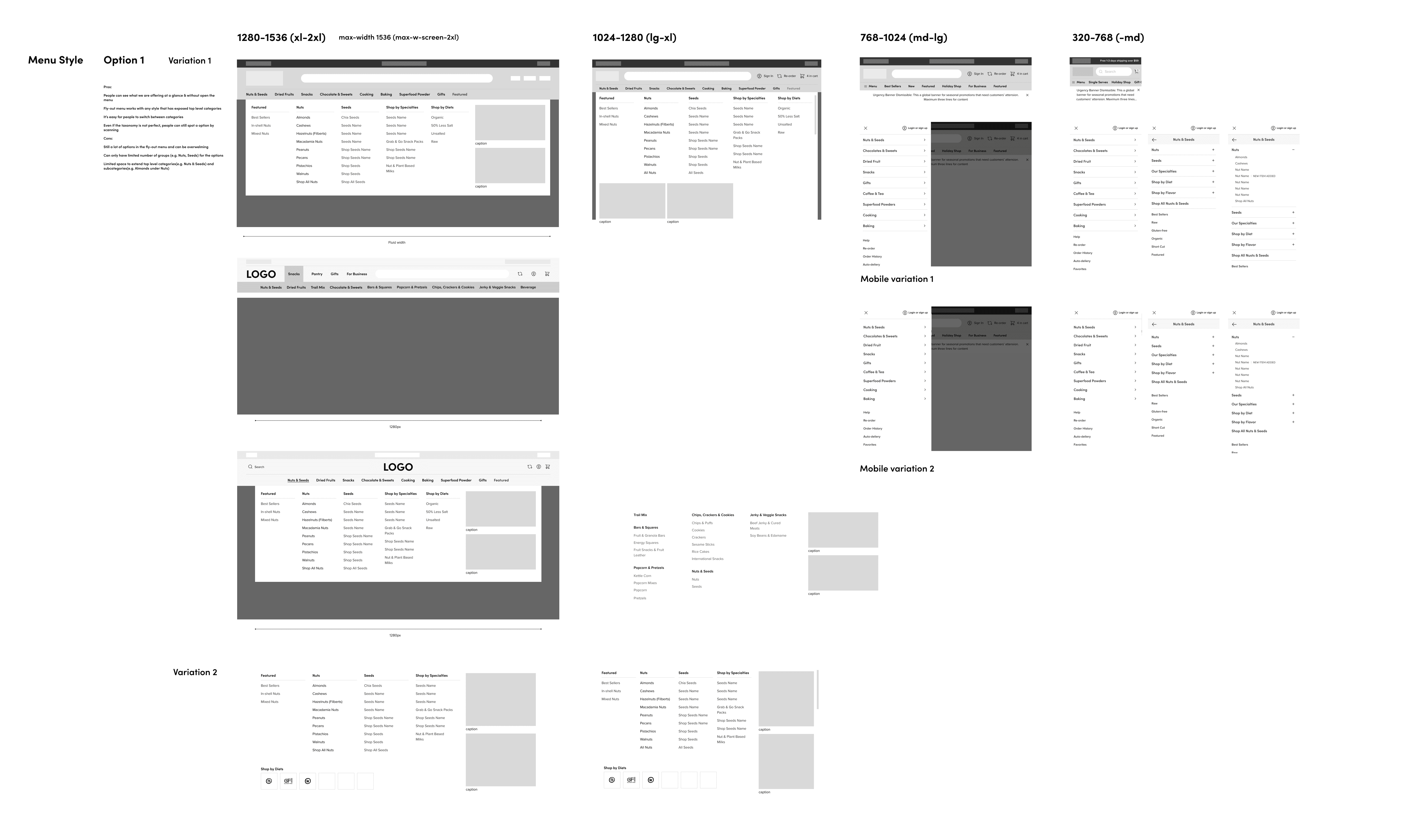
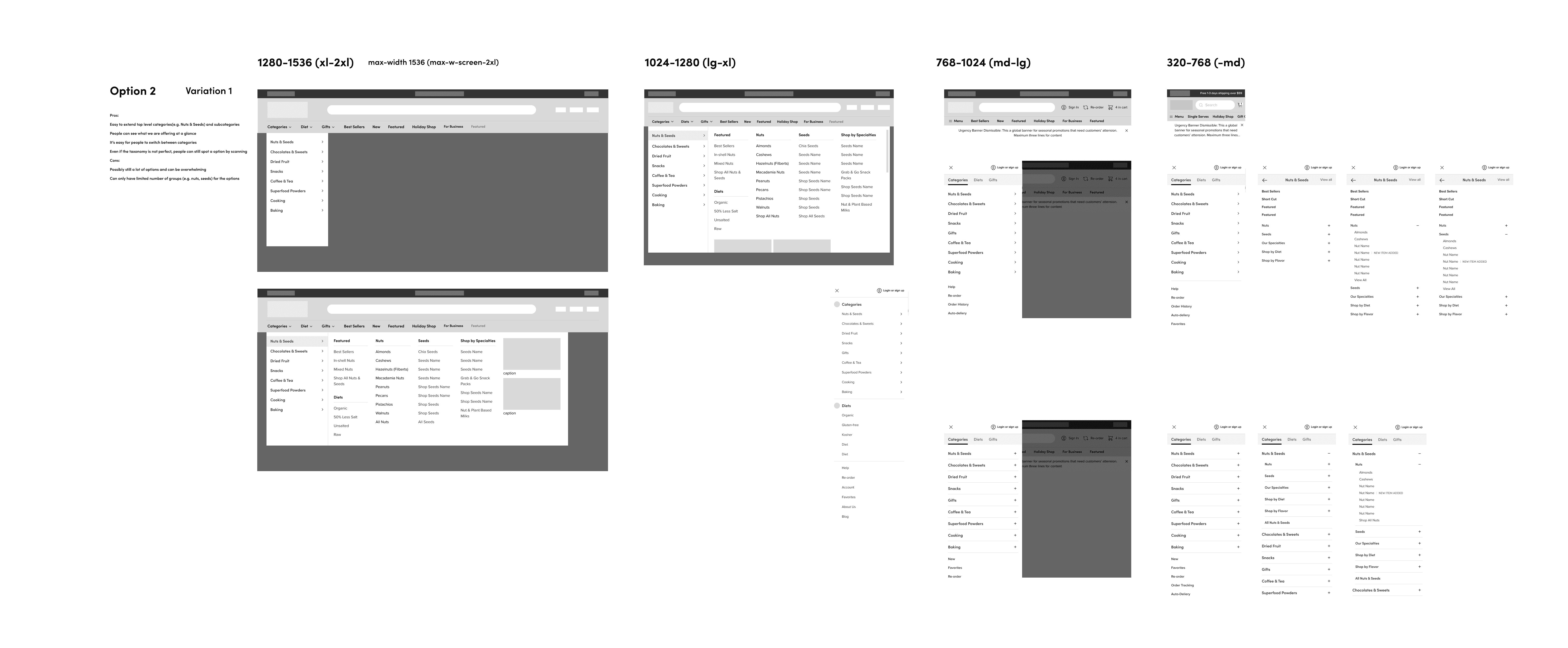
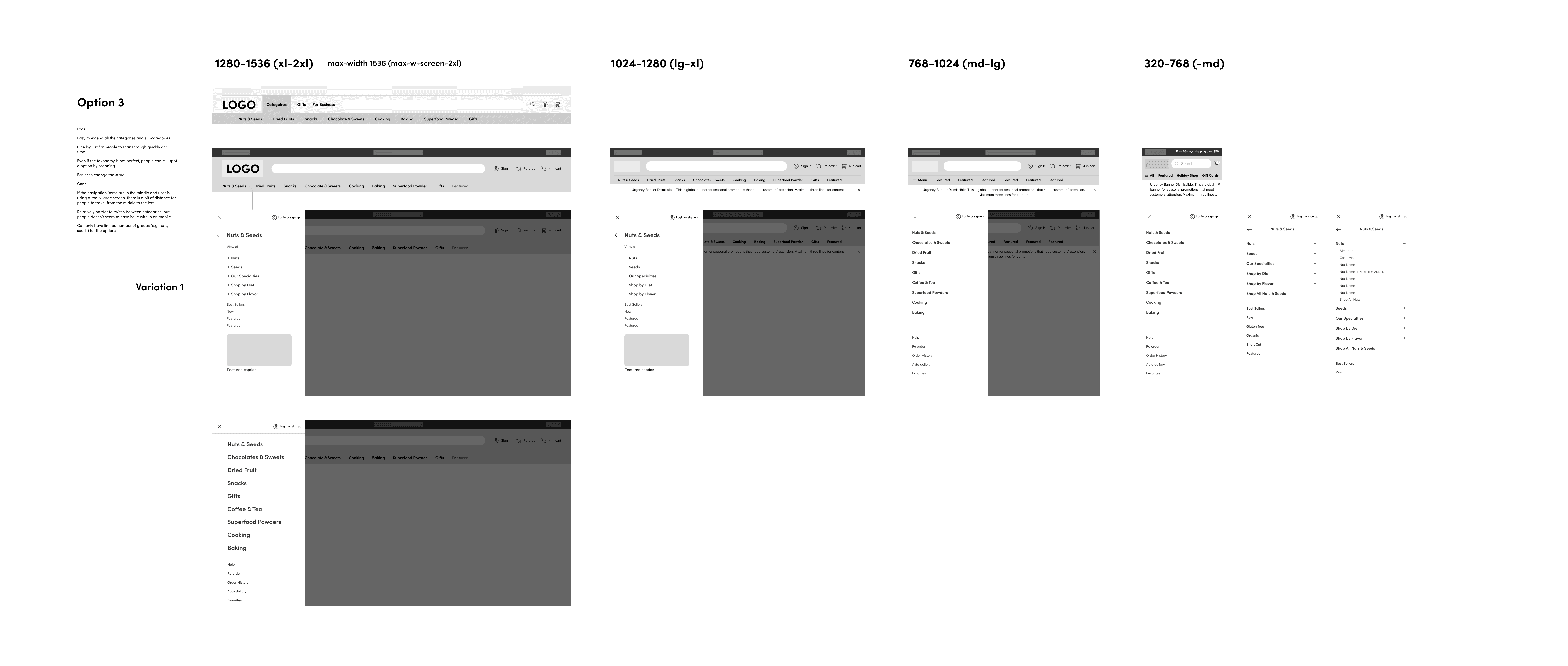
After discussing the designs with Engineering and the Merchandising teams, there are a few limitations emerged:
Limitation 1: Search - due to the set up of backend tool that powers the search suggestions, a few features that I proposed was not feasible unless we clean up the product tags
Limitation 2: Navigation IA - merchandising team didn't have the resources to do a full revamp for the category structure within the timeline
The solution: A phased rollout plan
Risk Mitigation Through Testing
Since the header redesign touched on so many parts, I conducted different tests to make sure that we:
Mitigate the risk and understand what changes made impact
Build confidence in stakeholders

Navigating Through Feedbacks & Changes
Although during the user testings, the overall feedbacks from participants were positive, when we ran the A/B testing live, a few issues emerged
Unexpected Challenges
😩
Challenge
🧐
Investigation
🔨
Iteration
😀
Result
Reflection & Learnings
This is a first large scale project that I led at Nuts that encompass end-to-end design, project management, strategy, and cross-functional collaborations. I learned a lot during the process and here are some of the biggest learnings:
Isolate changes for testing impact on specific metrics
When data tracking and analytics capability is limited, it's better to isolate changes for the test in order to get a more accurate learnings on how the changes impact a specific business metric.
The header navigation redesign was a project that touched on many facets of the business, including DTC customer acquisition, retention, and B2B, and different design changes had different impacts. For my next project at this scale, I would design with all the metrics in mind but then work with my PM to break the test into focus areas so that we can better gauge design impact based on business metrics
Scope all dependencies early on
One of the things that I did well for this project was to present the ideas early on to the cross-functional team to gain strategy alignment, but there were still some dependencies that I missed, for example the B2B lead landing page entry point. So for my next project, during the project scoping process, I'd pay more attention to the dependencies that would be impacted by the design changes and work with the stakeholders on a plan to mitigate the risk.