Design System, Design Leadership, Zero-to-One
Building and scaling Nuts.com's first design system

Impact
Within 3 months of starting the project, I was able to launch the MVP of the design system in Figma and Storybook. We immediately saw a decrease in inconsistency and an increase in efficiency.
The process and roadmap that I built ensured the team to continue to scale the design system with ease. After other designers joined, we were able to scale the design system fast in the following months. By the end of 2024, the team was able to scale the number of components by 120%
The design system pave the ground for the redesigns and rebrand following its launch, helping the business continue to grow efficiently.
Timeline
2022 - Building the design system from 0-to-1
2023 - 2024 - Scaling and maintaining the design system
2025 - Adapting the design system to the new brand (on-going)
Collaborated with
Director of Product, Creative Director, Front-end Developers, Product Designers
ROLE
Lead Designer
Year
2022 - 2024
Project Design Process Overview
📈
Set up goals and design philosophies
🧐
Audit the existing components
👨🏻💻
Define the scope & priority
🎨
Laying the foundations
🚀
Launch MVP
🧪
Expand beyond the basics
👮
Governance & contribution guidelines
🎨
Continue iterating & contributing to the system
The Problem
The e-commerce business experienced exponential growth during 2020–2021. However most parts of the site still lived in early 2000s. When I joined, the site was undergoing revitalization, resulting in a mix of old and modern UI/UX patterns with notable inconsistencies.
While the team was expanding, the design team had just switched to Figma and the only documentation we had was a style guide. The lack of UI/UX design documentation and reusable components led to inefficiencies in onboarding, production, and delivering a consistent customer experience.
As part of the goal to make the site modern, responsive, accessible, and intuitive, I led the creation of a design system to serve as the foundation for future business growth.
Goal
Consistency, accessibility, and scalability
To make the component work for both customers and business growth. I worked with the Director of Product and Creative Director on coming up with this goal.
Design Philosophies
1. Friendly, accessible, and familiar 2. Quirky and fun 3. Build trust in every interaction 4. Efficient - help people achieve their goals quickly, accurately, and with less efforts
I worked with the Creative Director on coming up these Design Philosophies to guide the creation of the components while maintaining the uniqueness of the brand
Component Audit & Categorization
I started with a site audit to understand what inconsistencies existed and how to fix them. I evaluated the components against a set of heuristics and design principles, and then documented all variations of the components by category.
Based on the audit I found a couple of issues:
Component Audit
Too Many Variants
There were so many variants of buttons, text styles, form inputs and other components. This made the site look messy and incoherent
Dated Color & Illegible Text
Some parts of the site had already went through redesigns using a new style guide but many parts were still using the old style back in early 2000s when accessibility was not taken into consideration
Missing States
One of the first things that I noticed about the website was it was very static because a lot of the components didn't have hover or other states to provide interaction feedbacks

Site audit & categorization
Scope & Prioritization
As the sole product designer when I started the project, one of the challenge was to balance building a design system with other UX initiatives. This required careful planning to ensure efficient execution.
After auditing the existing components, I collaborated with the Creative Director and Front-End engineers to develop a priority list. To achieve our goals of consistency, accessibility, and scalability, I asked myself these questions to help me prioritize:
Principle #1
What impact would leaving a component's inconsistency and accessibility issues unaddressed have on usability and user experience?
Principle #2
How much effort would resolving a component's inconsistency and accessibility issues require?
Impact effort Matrix
Laying the Foundations
Following the prioritization list and Atomic Design principles, I started out with the bones of the design system, which are the typographies, color palette, and atom components. Working with the Creative Director and Director of Product, I based the core color palette off of the latest brand guidelines and redesigned pages, aiming to encapsulate a fun, quirky, and colorful brand.
Then I expanded the color palette to ensure accessibilities standards were met. I learned from our Front-end Engineers that they were using Tailwind CSS, so for the font sizes, I adapted the Tailwind CSS font size scale but reduced the font sizes options so that designers can avoid choice paralysis.
Expand Beyond the Foundations
After solidifying the Atoms, I expanded the components following Atomic Design principles and expanded the library to have Molecules, Organisms, and Templates
Accessibility Baked Into the Process
When I started out the project, I worked with the Creative Director, the Director of Product, and Lead Font-end Engineer on coming up with the design principles for the design system, and one of them was “Friendly, accessible, and familiar”. So accessibility considerations were incorporated into the process at the very beginning. Some of the considerations included:
Accessibility Considerations
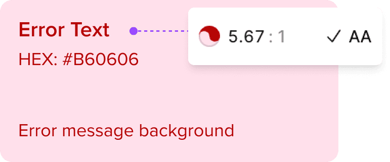
Color Contrast

Eligible Sizes
Intuitive Accessibility Labels
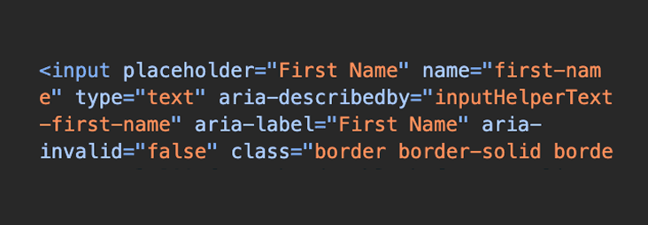
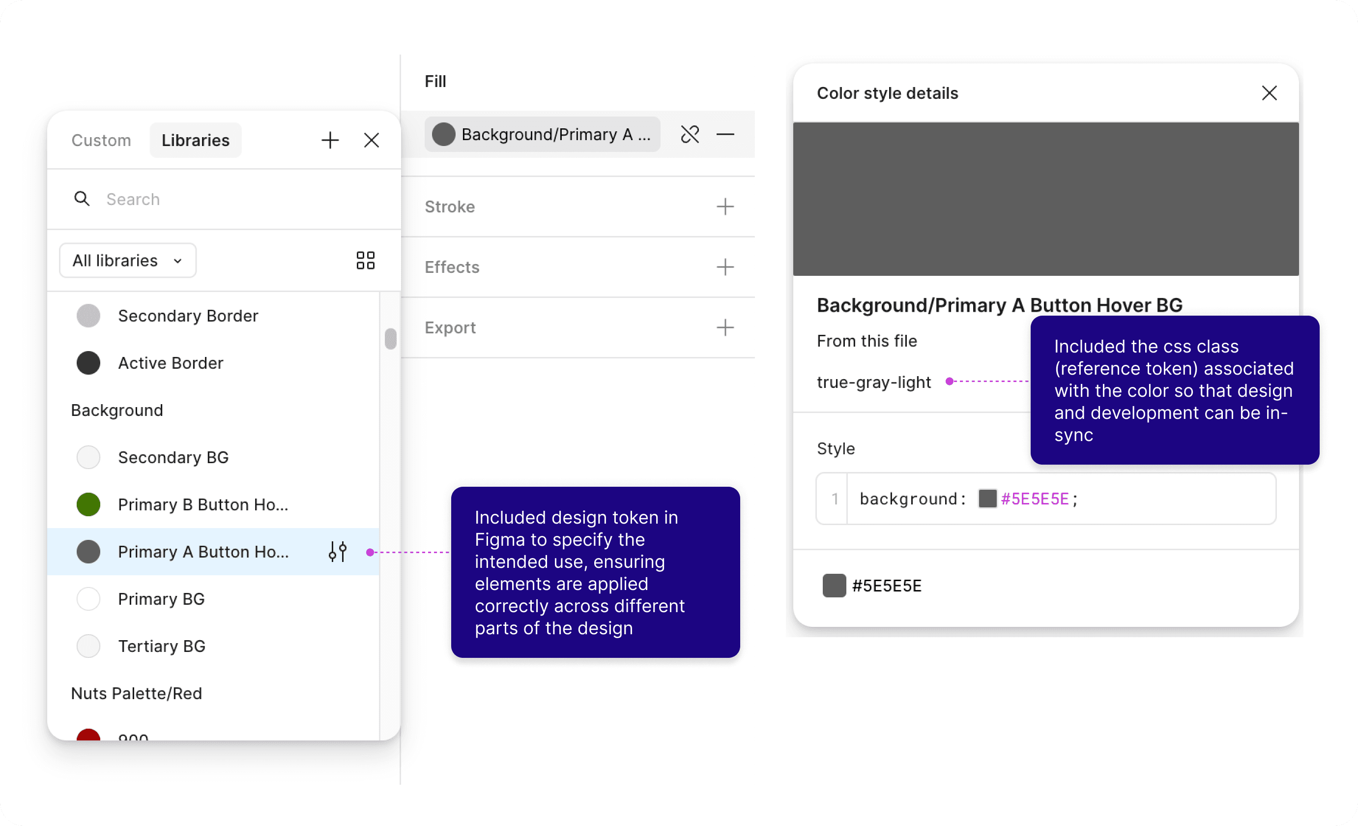
Ensuring Designers & Developers Are in Sync
One of the philosophies that I set out at the beginning of the project was efficient - help people achieve their goals quickly, accurately, and with less efforts, aiming to help not just for the customers, but also for the internal teams.
So I worked with one of our senior front-end developers to incorporating tokens and css classes into Figma, as well as building components in Storybook for visual references
Design & Development Sync
Guidelines & Governance for A Growing Team
After launching the MVP of the design system, the design team grew from me being the only designer to a 3-designer team. Based on the feedbacks from other designers, I soon realized that a set of components is not enough to maintain a successful design system. There needs to be enough context and guidelines to make it accessible to all internal users. To achieve that, I made sure that I provided these documentations for components I created:
component Guidelines & Governance

Besides that, I worked with the the rest of the design team and built the process of how to collaborate and contributed to the design system. Since all of us was working on redesigning parts of the website, it was crucial to sync on new components we introduced and old components we deprecated. I initiated bi-weekly component sync meetings with both design team and dev team, so we can keep each other up-to-date on components changes to maintain a consistent and scalable design system
component Guidelines & Governance

Results & Learnings
Within 3 months of starting the project, I was able to launch the MVP of the design system in Figma and Storybook. After other designers joined, we were able to scale the number of the components in the design system by 120% by the end of 2024.
Wins
Based on the feedbacks from the internal team members, the design system helped:
reduce time needed to code the components
save time during QA
ensure design and implementation consistency
For the business, the design system helped:
reduce design and development time for shipping new features or redesigns on the site
provide a more consistent experience across the entire shopping journey
prepare the business for future rebrand